
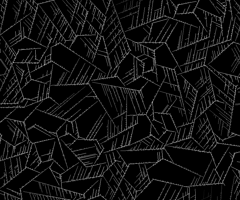


Diffusion Limited Aggregation
DLA simulates particles diffusing onto to a growing boundary based on various rules.
As the boundary grows, the number of particles available for further growth decreases. This, combined with rules about how particles attach to the boundary, creates distinct patterns.
This was initially written to create patterns I could use with an erosion shader to create the effect of growing frost.
Writing various space paritioning structures (fast hierarchical nearest-neighbor, simple grid, sparse grid) was necessary to diffuse millions of particles at a reasonable speed.
C#
Polygonal Straight Skeletons
A straight skeleton is created by offsetting a polygon's edges (in this case, inward) and creating nodes where vertices collide or edges collapse.
The straight skeleton is useful in many ways, such as offsetting polygons without self-intersections, creating 3D roof geometry from 2D shapes, approximating the 'backbone' of a concave polygon, and various kinds of analysis.
This was a surprisingly difficult algorithm to implement properly. Naive iterative approaches give bad results.
Rewriting my first attempt, I realized collisions could be accurately found by representing 2D movement in 3D space-time. Collisions between vertices and edges became intersections between lines and quads, where the vertical axis was time.
There's a more generalized version of the PSS called the Polygonal Straight Skeleton Line Graph, which looks fun.
C#
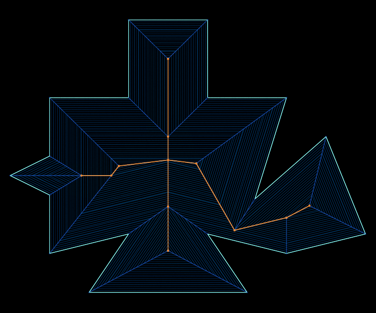
Edges move inward (blue) until they collide or collapse, creating a node in the skeleton (orange).
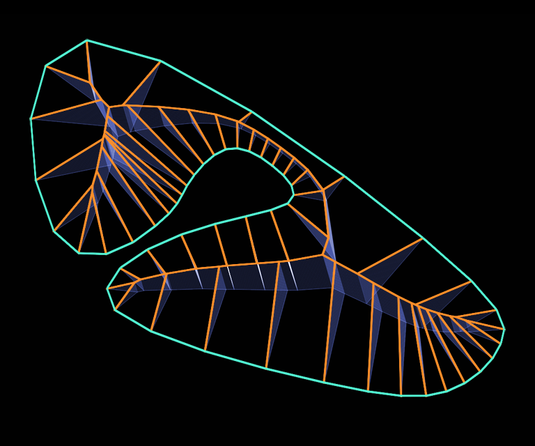
Using each node's creation time as the vertical axis, a 3D 'roof' is created from a flat polygon. A roof created this way has the same slope everywhere, which is neat.
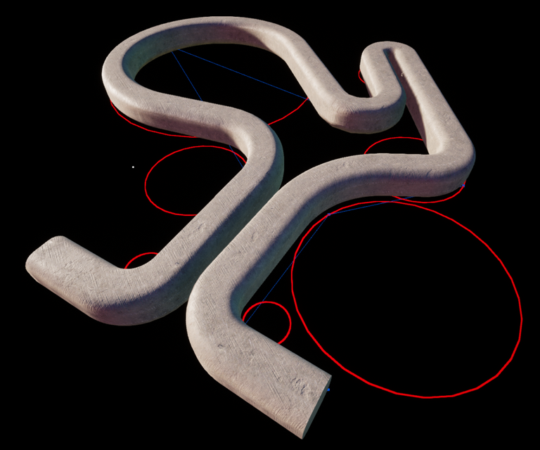
Motorcycle Graphs
A motorcycle graph splits a concave polygon into convex sub-polygons by shooting 'motorcycles' inward from concave ('reflex') vertices and colliding them -- either head-on, into the path of another motorcycle, or into an edge of the original polygon.
Where two motorcycles collide head-on, they both terminate and spawn a new motorcycle that bisects their collision in a Y.
(Why didn't they call them LightCycle Graphs?)
This is closely related to the Polygonal Straight Skeleton, but not as difficult to implement; uses the same 3D spacetime approach as mentioned above.
C#
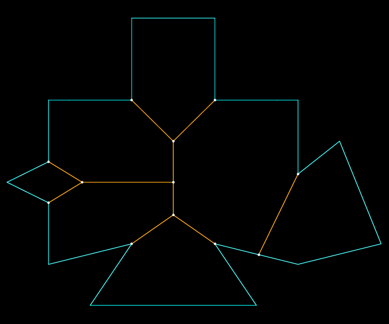
Emitting 'motorcycles' from concave vertices until they collide, forming a graph (orange).
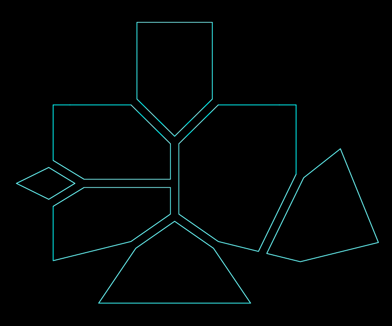
Splitting the concave polygon by this graph yields a set of convex sub-polygons.
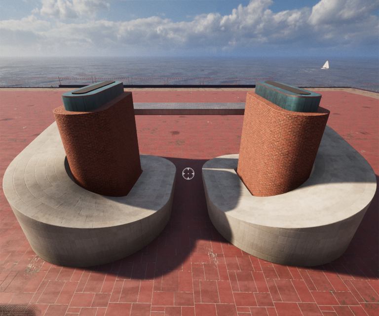
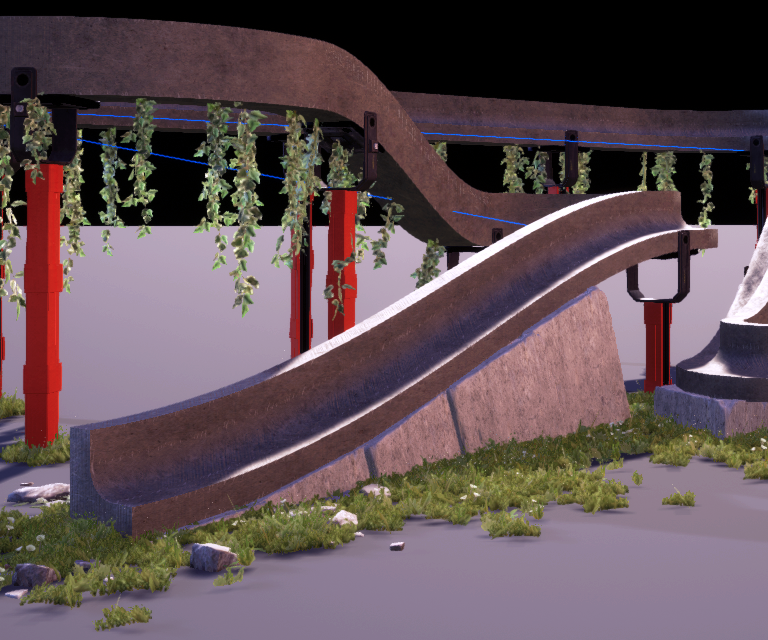
Roller Splines
Linear sections with circular corners, mimicking a serpentine belt rolling over pulleys, supported a variety of interesting shapes while restricting curvature to avoid self-intersecting geometry.
Built and adjusted in real-time by the player to create 3D extrusions ("Sweeps", shown in these examples) for ramps, walls, pathways, and so on.
Shapes may be open or closed.
C++, Unreal 4, 2020
Note that spline points lie on the circumference of rollers, not their centers. This was very important for interactivity despite complicating the implementation.
Roller spline used with a sweep
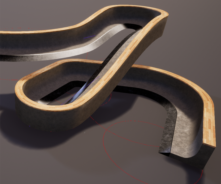
Even though roller splines fully supported banking (3D roll), for THPS it was more important to keep things flat as elevation changed.
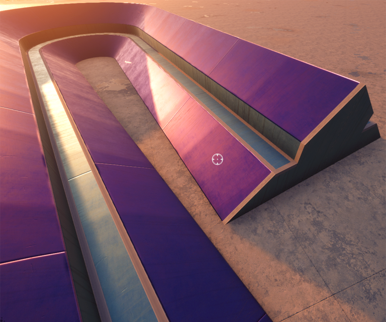
Sweeps
Sweeps are 3D extrusions of 2D profiles along a path. A 3x3 lattice deformation is applied to the profile continuously along the path, which creates variation over the path by changing dimensions or [de]emphasizing certain features of the profile.
Sweeps support multiple materials defined on sections of the profile, various texture mapping modes, piecewise composition along a single path, procedural trim generation, surface usage hints, and physics mesh generation.
C++, Unreal 4, 2020
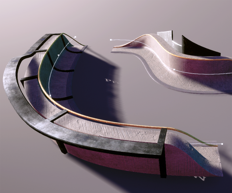
Composite sweeps -- using multiple sweeps with various parameters to build up complex objects along single splines.
Trim could be generated at the ends or along any section of the profile.
Using closed sweeps to generate more construction-like objects
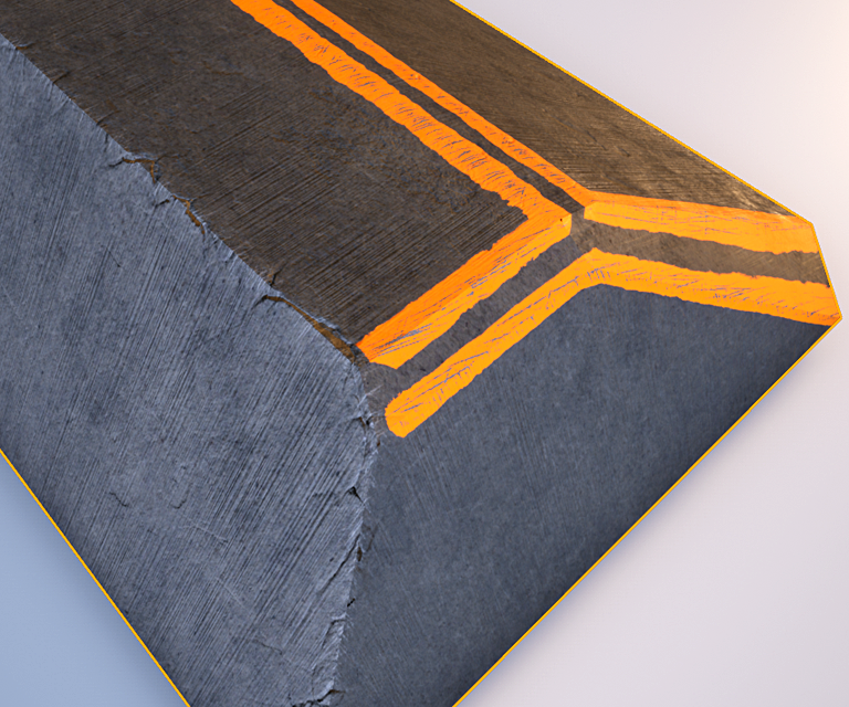
Lumps
A lump is a super customizable box primitive. They support rounded corners, bevels, tapering, holes, cuts (and tapering on the cuts), procedural wear, and various kinds of trim.
C++, Unreal 4, 2020
A lump with beveled edges, procedural wear and paint
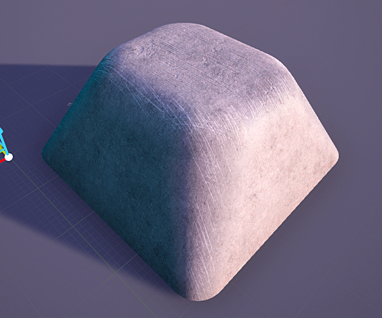
A very smooth lump with procedural wear
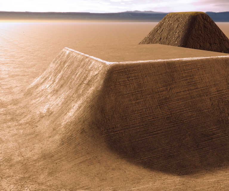
A lump with different top & bottom rounding, blending in with the ground material
Nature Brush
This was an experiment in raycasting along a spline to place collections of instanced meshes based on various rules. For example, the ray's distance to ground could be used to choose from different object sets, modulate mesh scale, or suppress creating any placement at all. The mesh's placement point could be determined by the intersection point, the spline point, or somewhere in between. The mesh's orientation could be aligned to the hit surface, the ray, the spline, or various combinations.
C++, Unreal 4, 2020
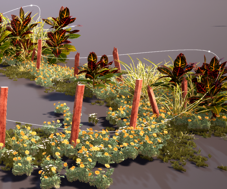
Spline height from ground determined which type of plants were chosen, the larger plants' scale, and straightness of the wooden posts
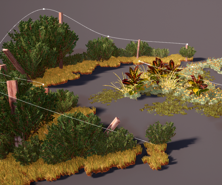
Various object sets with the same rules
The rocks, grass, red beams, hanging plants, and stone blocks were all placed with this system from a single spline
VFX Curve Control
When you're making VFX, you spend a lot of time making curves to drive pretty much everything. I had the opportunity to create an ideal curve control, emphasizing speed and flexibility.
Main pillars:
C#, WPF, 2016
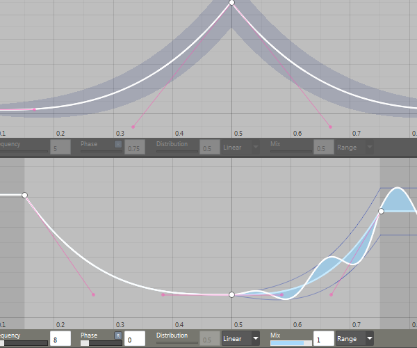
Two curve controls stacked; top curve shows unmodulated random range, bottom curve shows a modulated range (function envelope).
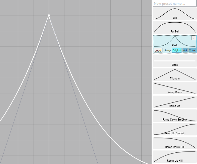
Presets were easy to save and could be previewed before loading. They could be loaded with their original range, normalized 0-1, or fit to the current curve.
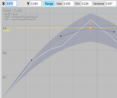
Using the position manipulator locked to the Y axis by dragging the vertical part of the crosshair, plus a handy horizontal guide
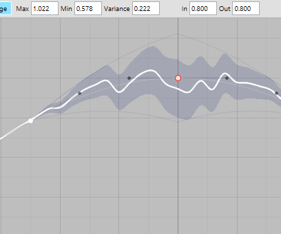
Using a curve's range as both a random range and as a function envelope in different proportions.
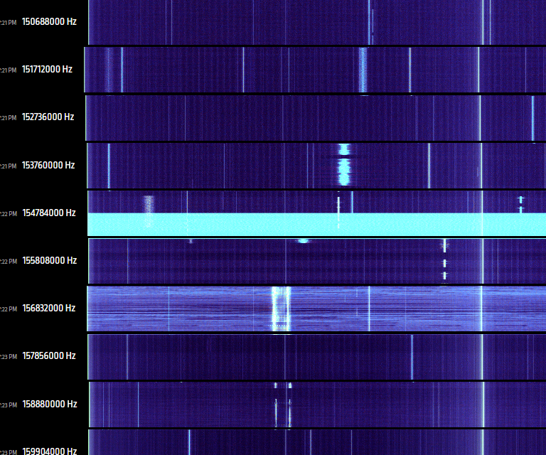
RadioBrain
This started as curiosity about working with realtime radio data from libsdr. Doing audio operations at a sample rate of 2.4MHz is pretty wild.
The project quickly evolved into an SDR controller which swept the spectrum looking for anything interesting. A diagnostic view was written out as a static webpage with slices of the scanned spectrum.
C#, libsdr, 2014
ColorDNA
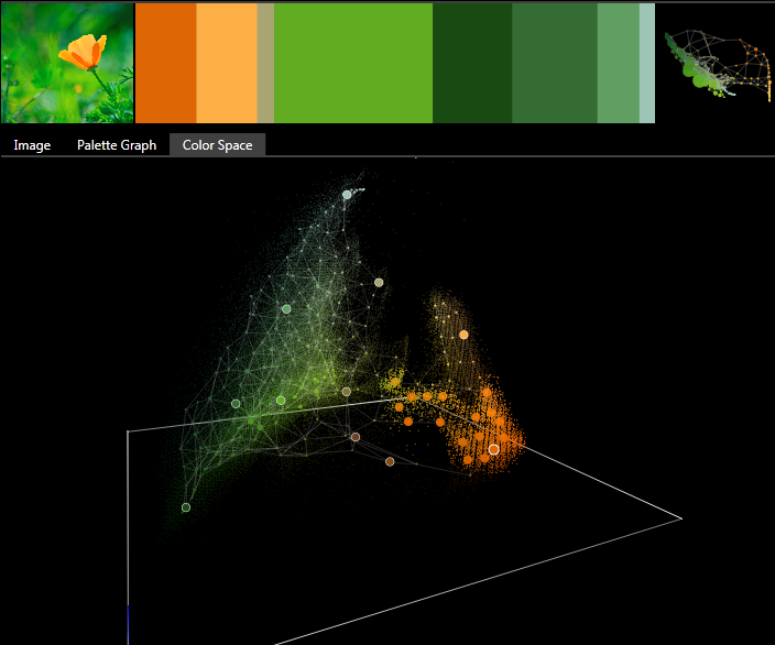
Combination of several experiments for the purpose of extracting a color theme that best repesents a given image.
Uses self-organizing maps and growing neural gas models to learn the topology of the color space.
Analysis modules are built up from a node-based function graph with support for loops, arrays and image-oriented connections, rendering, caching, and performance tracking.
C#, WPF, 2013
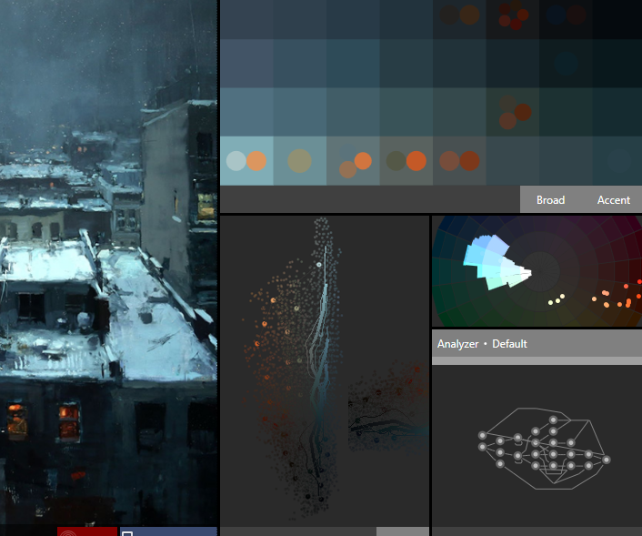
A monochromatic theme with small contrasting accent colors; difficult to capture
Displaying an image's theme as slices with thickness based on importance, and an attempt at 'skinning' the color space to a GNG skeleton for color manipulation.
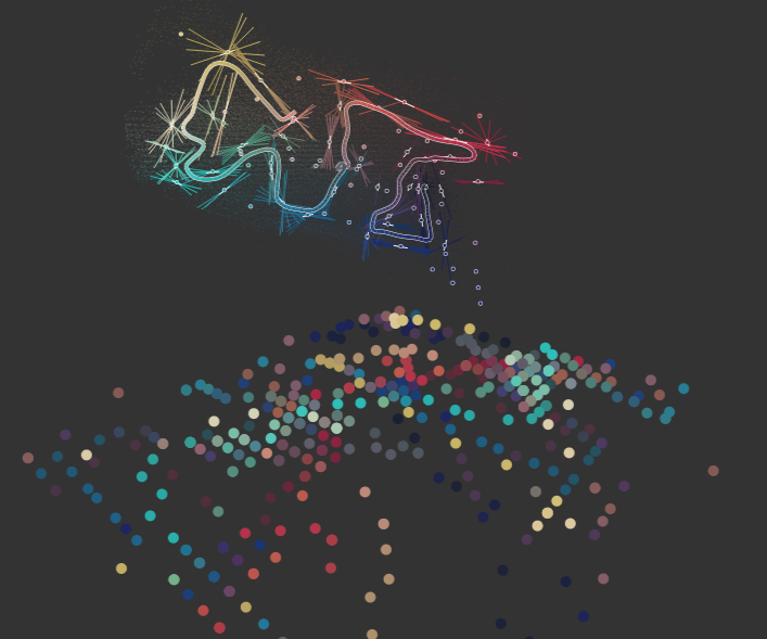
Not only capturing colors used in an image, but also how they're used in proximity to each other (lower left palette, self-organizing map of embedded color-proximity space)
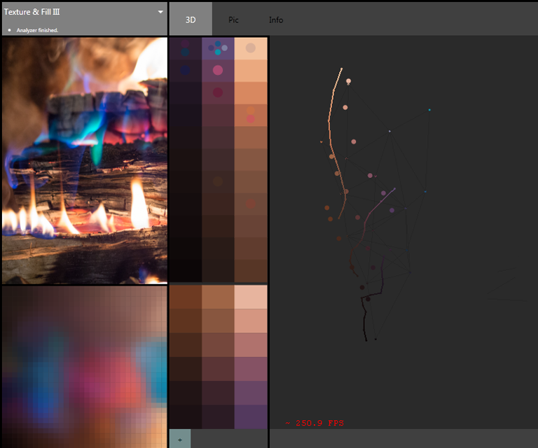
I don't remember what this is doing, but it sure is pretty.
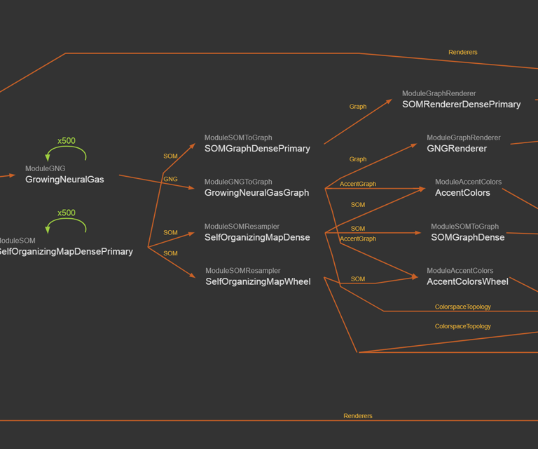
One of the analyzer graphs used here, combined self-organizing map & growing neural gas analysis with color wheel and accent colors
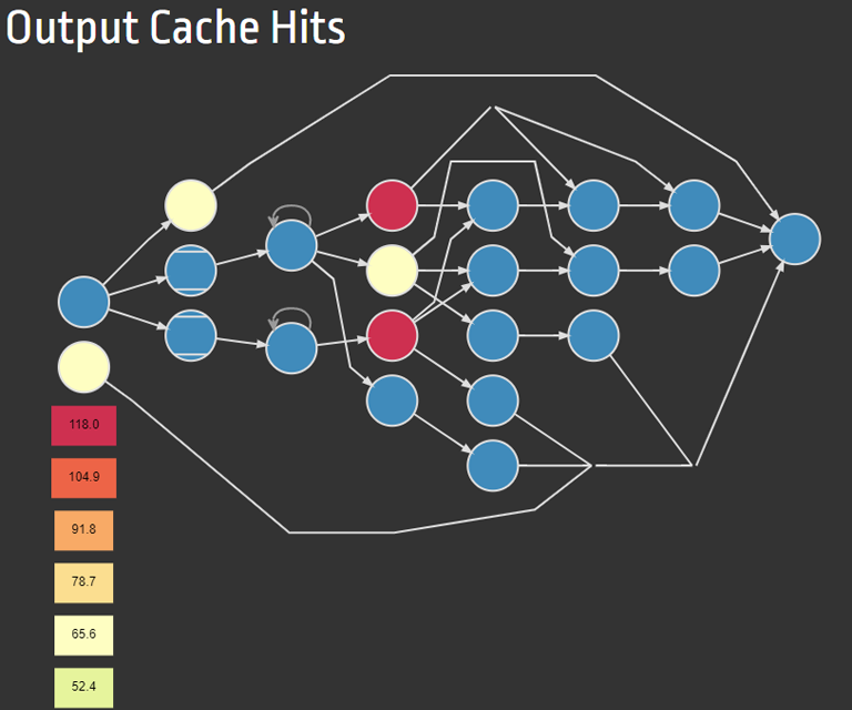
Diagnostic view of a graph's cache behavior
Atom
Admittedly, I had a period of obsession with function graphs. Devising implementations had a nice blend of difficulty & creativity.
Atom was my second generation of node-based image analysis projects; where my previous attempt was C++ and OpenGL based, this one was a mix of C++ and C# with a real GUI.
The core functionality was written in C++ and bound to C# (via SWIG) to present a user-friendly interface (GTK).
C++, C#, GTK, 2008
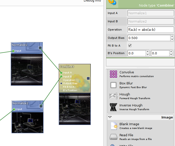
Selected node properties, and below, a nice looking node creation palette; Atom also supported inline function evaluation (shown here) for user-defined operations
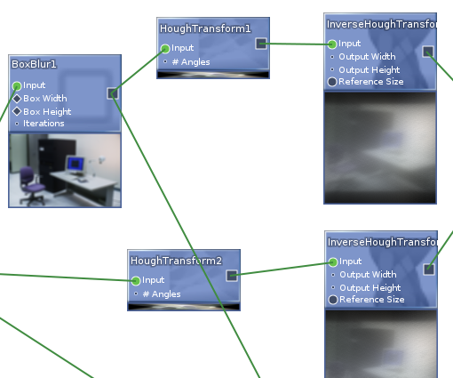
Interactive nodes with previews; supported single- and multi-image data (used for things like convolutions and multi-scale operations)
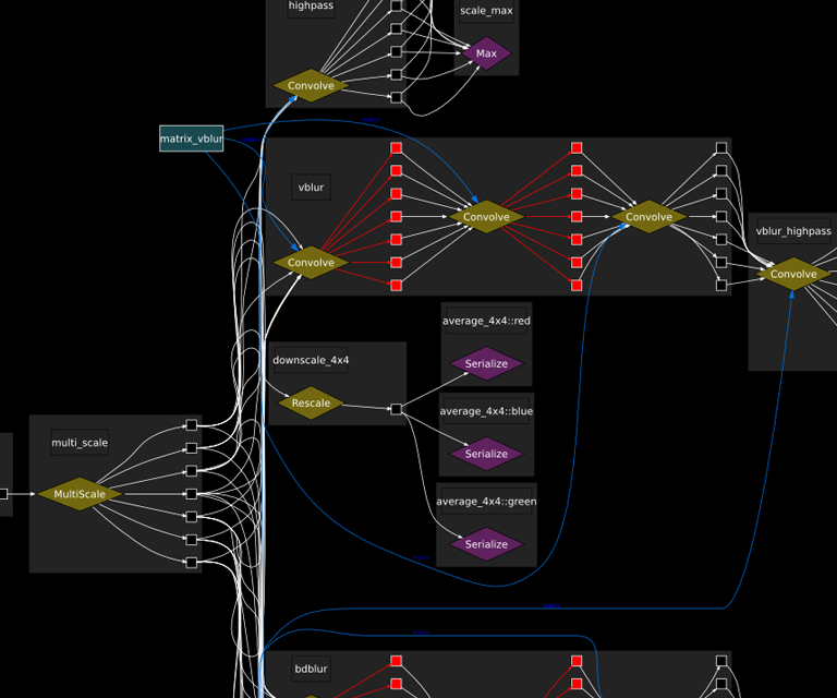
Raw internal view of an arbitrary graph showing the multi-image data flow which was normally transparent to the user
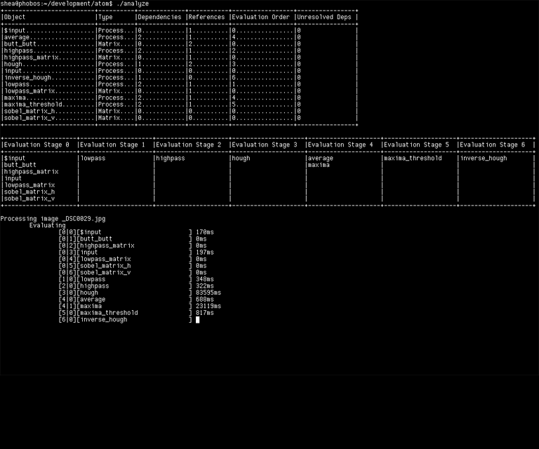
Atom's original command-line interface showing nodes and evaluation stages. Those processing times look fun!
Geos
I started writing Geos to get first-hand experience of the challenges in writing a 3D game engine, and to use C++ as hard as possible.
Supported features:
C++, 2007
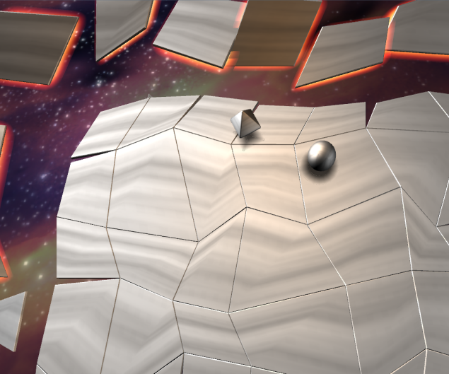
Example called 'Push Wars' with physics, player input, scripted entities, various materials and blend modes, and a scene exported from Maya
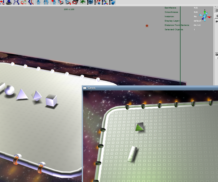
Scene constructed in Maya (left) and then exported to Geos (lower right)
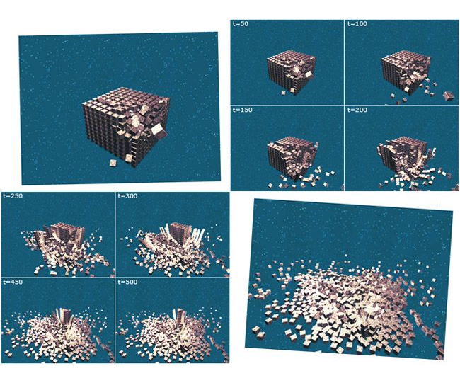
Physics simulation of 1000 boxes getting hit by a fast projectile and gradually collapsing
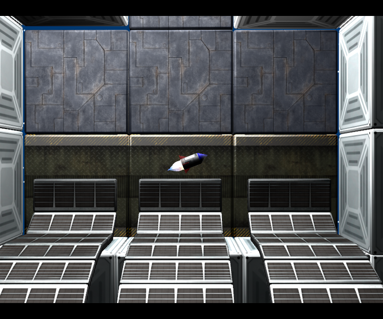
Example called 'Rocket Quest' where you hurl an over-powered rocket through a platformer style level, avoiding hazards to find the exit
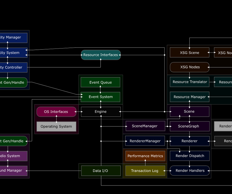
Section of the engine structure